Bar Graph – Types of Bar Graphs
Type of Bar Graphs
In this lesson, we will learn about bar graph or bar chart. We also focus on the different type of bar graphs, definition of bar graph how to create bar graphs.
A graphical representation of data, in which bars show comparisons between categories of data.
A bar graph is a simplest representation of data.
In a bar graph data is presented in horizontal or vertical rectangular form. A bar graph has two axis, one is horizontal and other is vertical. Bars can be drawn horizontally or vertically with equal spacing between them.
When develop a bar graph, draw a horizontal or vertical bar to show each category or value. The height or length of the bar is represent the number of observations in that category.
The length of each bar represents the given number. A bar graph have two axes. one axis describe the types of categories being compared and other will numerical values of data.
It does not matter that which axis is which, but it will important that what bar graph is shown.
A bar graph can be drawn horizontally or vertically depending on the choice of the axis of the base.
Properties of Bar Graphs
1. The width of bars are uniform, and space between them are equal.
2. All bars have a common base.
3. The height or length of the bar represent the corresponding value of the data.
Construction of a Bar graph
Step 1. Draw two perpendicular lines intersecting each other at a point O.
Step 2. The horizontal line is the x-axis and the vertical line is the y-axis.
Step 3. To determine the height of each bar choose a suitable scale.
Step 4. Draw the bars at equal distance with corresponding heights on the horizontal line.
Step 5. The space between each bar should be equal.
Types of Bar Graphs or Bar Charts

Type of graphs
1. Vertical bar graph
2. Horizontal bar graph
3. Range bar graph
4. 100% Stack bar graph
5. Stack bar graph

Vertical bar graph
Bar graphs with vertical bars are called vertical bar graphs. In vertical bar graph horizontal line (x -axis) uses for labelling.

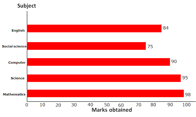
Horizontal bar graph
Bar graphs with horizontal bars are called horizontal bar graphs. In horizontal bar graph vertical line (y-axis) uses for labelling.
If data has positive and negative values, then it is more convenient to represent a horizontal graph. The vertical axis, drawn in the middle of the horizontal axis, allowing for negative and positive values.

Range bar graph
A range bar graph can be represented in either horizontal or vertical bars. A range bar graph show a range of data for each independent variable. price range or temperature range of data are common for range graphs.

100% Stack bar graph
100% Stack bar graph show the percentage of the whole of each group.
100% Stack bar graph are show the percentage of each value to the total amount in each group.
This graph is easier to see the quantities in each group and relative difference between quantities.

Stacked bar Graph
A Stacked bar Graph chart show sub groups are stacked on same bar.
In a simple stacked bar graph each value of the segment place after the previous value.
When all the segment values added together we get the total value of the bar.
A stacked bar graph is used to compare many different items.
This should be used to compare many different items and show the composition of each item being compared.
A stacked bar graph is very difficult to analyses, because it has many items in each stack and also comparing difficult to each segment to other segment.
A stacked bar graph is not aligned on a common baseline so, someone who does not read the graph carefully it can be misleading.

